
How to Analyse Marketing Surveys – Part 2
In our previous blog post, we analysed survey data using univariate analysis. We explored each survey question independently.
This gave us an overview of the data and some interesting insights, but to get deeper and more meaningful insights we need to analyse the relationship between multiple variables.
In this blog, we will look at bivariate analysis and how to find the scientific significance of the insights found.
To refresh your memory, here’s the sample data:
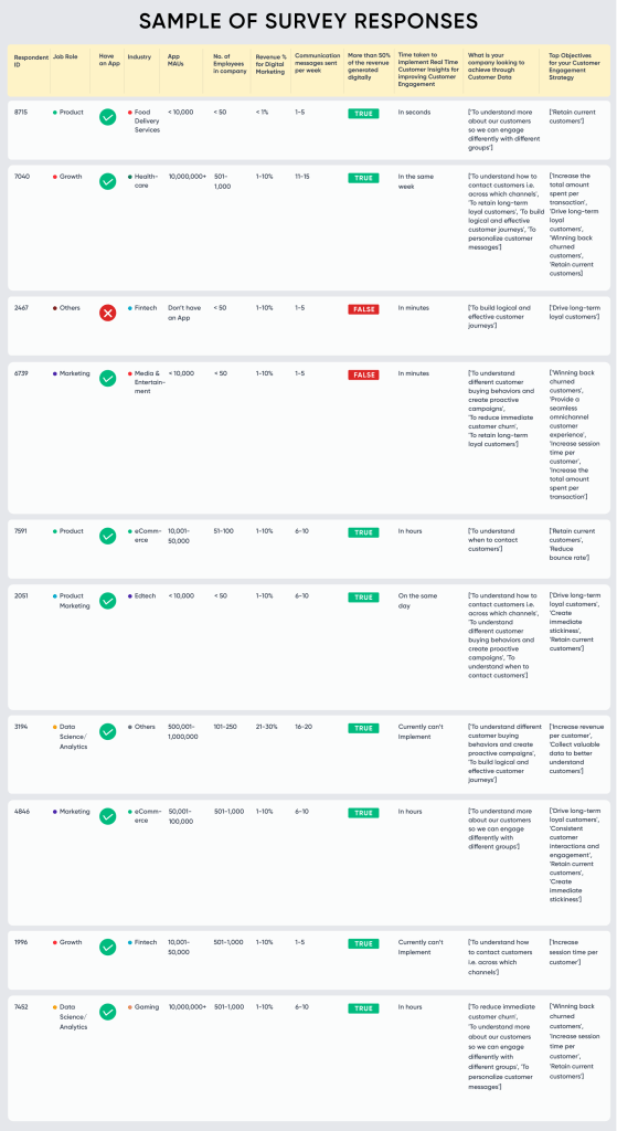
This is a survey dataset collected from a market research study which aimed to survey professionals in the B2C vertical with the intent of understanding how they are dealing with new realities in the Post-COVID era to drive growth and also observe the behavioural changes in both customers and marketers.
Bivariate Analysis
Bivariate Analysis looks at the relationship between two variables, enabling us to find how one variable influences the other. For example, we could look at how Industry and Digital Marketing Spend are related to each other.
But the number of possible combinations grows rapidly with an increasing number of variables. For instance, in this sample dataset, we have 12 variables. The number of variable pairs that we can create here is 66, which is too many to analyse by hand. Furthermore, not every insight is meaningful. Some can be attributed to random chance.
So How Do We Find Bivariate Insights From the Data?
- Create a pivot table/crosstab of the two variables you are considering.
- Calculate the Chi Square and p value to test for significance of the relationship between the variables.
- If significant, create heatmaps to find standout insights within the crosstab
Steps
Let’s break down each step in the process:
1. Pivot Table / Crosstab:
A crosstab or contingency table shows us the relationship between two variables. Each cell in this table contains the count of observations matching the conditions specified. This table is further used to calculate statistical significance using various tests.
| Male | Female | ||
| Passed | 20 | 35 | 55 |
| Failed | 10 | 15 | 25 |
| 30 | 50 | 80 |
In the above example, we can find if there is a relationship between gender and whether a person will pass or not.
2. Significance Test:
Chi Square tests are used to find if two variables in a contingency table are independent or not. p value can be derived from the Chi Square score. The p value is the probability that the variables are independent.
If the p value is below a certain predetermined threshold, the variables can be considered to be dependent, meaning that the variables impact one another. This gives us scientific evidence to back up our claims.
3. Heatmaps:
These help us visualize the crosstab in an easy-to-digest manner. We can create 3 heatmaps: counts, column-wise percentages and row-wise percentages. Each gives us a different view of the variables. (Heatmaps are not necessary but they are a good visual representation).
Examples
Let’s look at some examples to understand this process further:
If we take the two questions: “Does your company have an app?” and “How often do you communicate with customers per week? ” the crosstab looks like this:

From the above crosstab, we can determine the p value using Excel/ SPSS/ Python/ R, etc. For reasonable significance of the relationship, we usually use a p value of less than 0.05 (i.e., there is a 95%+ probability that the visible relationship between the variables is not random).
These crosstabs can be easily created using pivot tables in Excel. (A good resource: Finding p value from a crosstab in Excel.)
The p value for this particular combination of variables is 0.0272, which is below the chosen threshold of 0.05, meaning that the relationship between the variables is statistically significant.
But what are the actual insights from the analysis?
If we take percentages across rows for the above crosstab, we get the following table:

Here we can see that:
- Almost half of those respondents without apps do not communicate with their customers once a week
- 58.5% (38.7%+ 19.8%) of the respondents with apps communicate with their customers between 1 to 10 times per week
Another way to look at the crosstab is taking percentages across columns, which could lead to different insights.
This process can be applied either to all combinations of variables, or the ones where you feel like an insight may be present.
Let’s look at another example where we think we could possibly find some insights: “Industry” vs. “Is more than 50% of your revenue generated digitally.”
First we create a crosstab:

Using this, we find the p value to be 0.3292. This is above our selected threshold of 0.05, hence we do not proceed with finding insights for this combination, as they would be statistically insignificant.
Other Insights
Using the process described above, we find various other significant relationships between variables that lead to interesting insights:
1. “Does your company have an app” vs. “Is more than 50% of your revenue generated digitally?“
Counts plot:
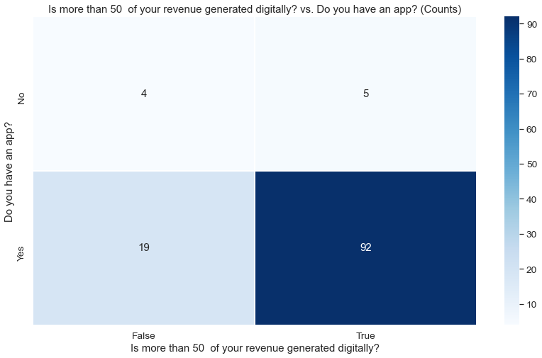
p value: 0.0452
Row-wise %age plot:

Insight: A much larger proportion of those with apps generate more than 50% of their revenue digitally (82.9% vs 55.6% in case of those without apps).
2. “Monthly Active Users” vs. “How Often Do You Communicate with your Customers per week“
Counts plot:

p value: 0.0461
Row-wise %age plot:

Insights:
- A good chunk of respondents with between 1 million – 10 million app MAUs communicate with their customers between 21-25 times a week (40% and 33.3%)
- More than 50% of respondents with less than 10,000 MAUs communicate only 1-5 times a week
- 44.4% of those respondents without an app do not communicate with their customers once a week
Is the Chi Square test enough?
The p value being less than 0.05 for a pair of variables tells us that the relationship between them is significant, but does not say anything about how important or powerful this relationship is. This is where Cramer’s V comes in.
Cramer’s V is a way of calculating correlation between multiple variables, which determines the strength of the association between the variables. It ranges from 0 to 1, the higher the better.


For the above relationship (“Do you have an app?” vs. “Is more than 50% of your revenue generated digitally?“), the Cramer’s V value is 0.1429, which can be interpreted as a moderate association. Hence, this pair of variables has high correlation, but are only moderately associated.
If we look at the following: “Do you have an app?” vs. “How often do you communicate with customers per week?” (🔗link), the p value is 0.0272 (<0.05), and the Cramer’s V value is 0.3243.
We can now compare the insights derived from the above two comparisons and say that the findings from the second are stronger, despite both being statistically significant.
This can help us narrow down which insights we really want to present.
Similarly, other bivariate analyses yield interesting, and sometimes expected insights:
“% of revenue allocated to digital marketing” vs “Is more than 50% of your revenue generated digitally?“

- p value: 0.0423
- Cramer’s V: 0.3962
- Almost 54% of respondents who spend less than 1% of their revenue on digital marketing do not generate a majority of their revenue digitally
“Industry” vs “How quickly can your company implement real time customer insights to improve customer engagement“

- p value: 0.048
- Cramer’s V: 0.3153
- 1/3rd of Healthcare industry respondents cannot use real-time customer insights to improve customer engagement
- Food Delivery Services and Banking and Finance are most ready to implement customer insights within hours (combining ‘In Seconds,’ ‘In Minutes,’ and ‘In Hours’)
- Most EdTech and Healthcare respondents have a considerable delay in implementing customer insights (in the same week)
Conclusion
Publishing statistics and numbers from surveys is meaningless if those insights are not statistically significant, especially when your survey audience is small, as is the case with most marketing-related surveys.
We looked at how to scientifically deduce deeper insights from survey data using bivariate analysis. This will enable marketers to claim findings from a survey or study with more confidence and better acceptance.


